
Bike Ranch Snowdonia
Logo Design | Launch Video edit | Brand update | Print | Van Decal design
The Project
Bike Ranch Snowdonia came to me as a brand-new business with big ambitions.
To become the mountain bike base in Snowdonia.
The brief? “Make it ASBO” Bold, disruptive, instantly recognisable, with a clear nod to Wales. They wanted to shout, not whisper.
After a successful launch and some strong years, Bike Ranch naturally evolved. Graduating from rebellious newcomer to a professional, established riding base. With this came a clean and slick rebrand, that could sit within the mountain bike arena.


Rewriting the story
Every story evolves, and so does a brand. A refreshed version of the Bike Ranch logo was needed.
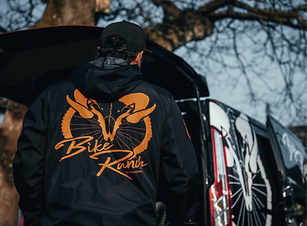
Original logo
The original logo used graphical elements with a sheep skull and bike wheel to create a clear nod to Wales and biking. With the addition of a grungy font that had movement and texture.
Make an impact
This logo, alongside a slightly muddy orange tone, stood out on the Welsh bike tracks. Orange branded t-shirts and a full van wrap spread the word in all the right places and Bike Ranch began to be known as the new base for mountain biking in the area.
New chapter
Bike Ranch now needed to 'graduate to big school' and appeal to the wider mountain bike profession. With 'Bike' in the name the wheel became unnecessary. By dropping this but keeping the skull and pairing it with a bold and blocky typeface, it sat perfectly in the mountain biking sphere and has helped attract professional teams, sponsors and customers to the Ranch to stay.


Charlie has been with us from the beginning; from helping to conceptualise the idea to bringing the branding and full launch to life. As the business developed and organically grew, Charlie was integral to shaping the direction of the brand in the way we knew it wanted to go. Creative, talented and a pleasure to work with - we highly recommend working with Charlie.
Bike Ranch Snowdonia