
Marine Cranes
Logo design | Brand development
The Project
Marine Cranes was an arm of an existing company. The aim of this project was to create a stand-alone brand, that not only maintains its strong reputation but also stands out and holds its own in the marine industry.

Storytelling
You know the story. I find the part no one’s told yet. Then I build the brand around it.
A new chapter.
In this project, I explored their purpose, reputation, and audience to uncover the story Marine Cranes needed to tell as a stand-alone brand. One that could honour its roots while confidently holding its own in the marine industry.
Page-turning design.
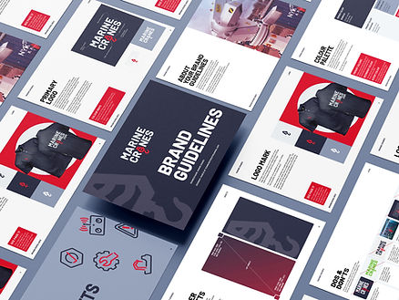
The marine industry is saturated and very blue. Marine Cranes needed to be modern, fresh and head-turning.
Rewrite the expected.
With a modern stand-out logo, unexpected yet relevant brand colours, and polished professional imagery, Marine Cranes now stands on its own and has already sparked real attention and excitement within the industry.


Charlie listened to and interpreted our vision for the brand and the messages we wanted to convey through the design. She understood the industry requirements and norms, creating something that was simultaneously appropriate but distinctive. We were super happy with the process and the end result.
Sarah Hickman, Marine Cranes